
Summary
Printmaking is a huge ordeal in Graphic Design–dating back to the historical roots of Japan where there were early processes of how the community was able to create works. The overall concept was to discuss the evolution of woodblock prints until the 1850s while holding on to its traditional ukiyo-e style. Asymmetry goes into depth of different techniques, inspiration of the printing process, and linear strokes used as the appropriation of traditional Woodblock prints. Textures and faded styles were the key elements incorporated in the publication to increase the historical culture of prints from Japan.
Accolades
2023 | AIGA Flux Student Design Competition Publication Finalist
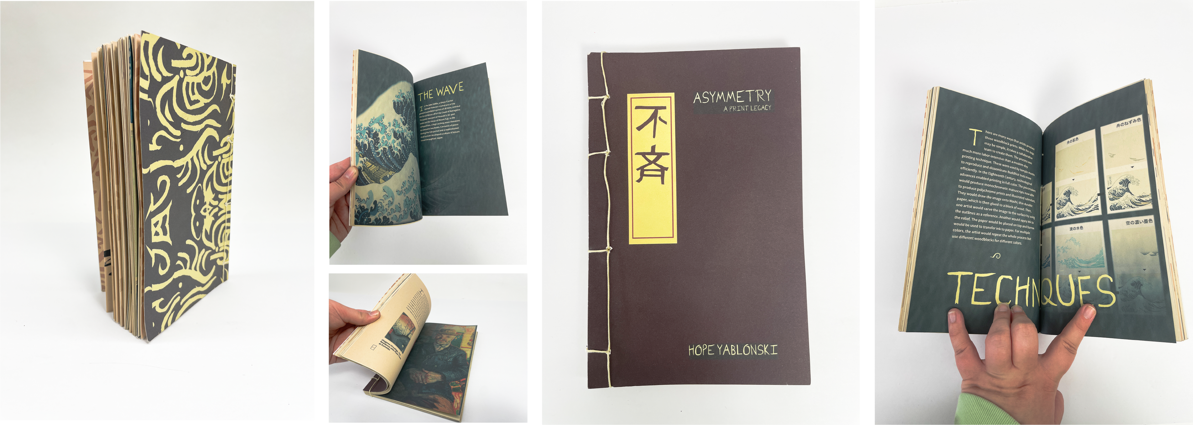

A traditional stab-bind was incorporated replicating publications that are made in the country. Some stab binds tend to have certain patterns that coincide with different themes curated into different publications. For Asymmetry, I went with a traditional symmetrical 4– stab bind pattern to incorporate balance throughout the publication. I used Aged–Fine Newsprint paper for the entirety of the book to showcase the faded look similar to old Japanese prints. The paper also helps give contrast to some of the color palette used.
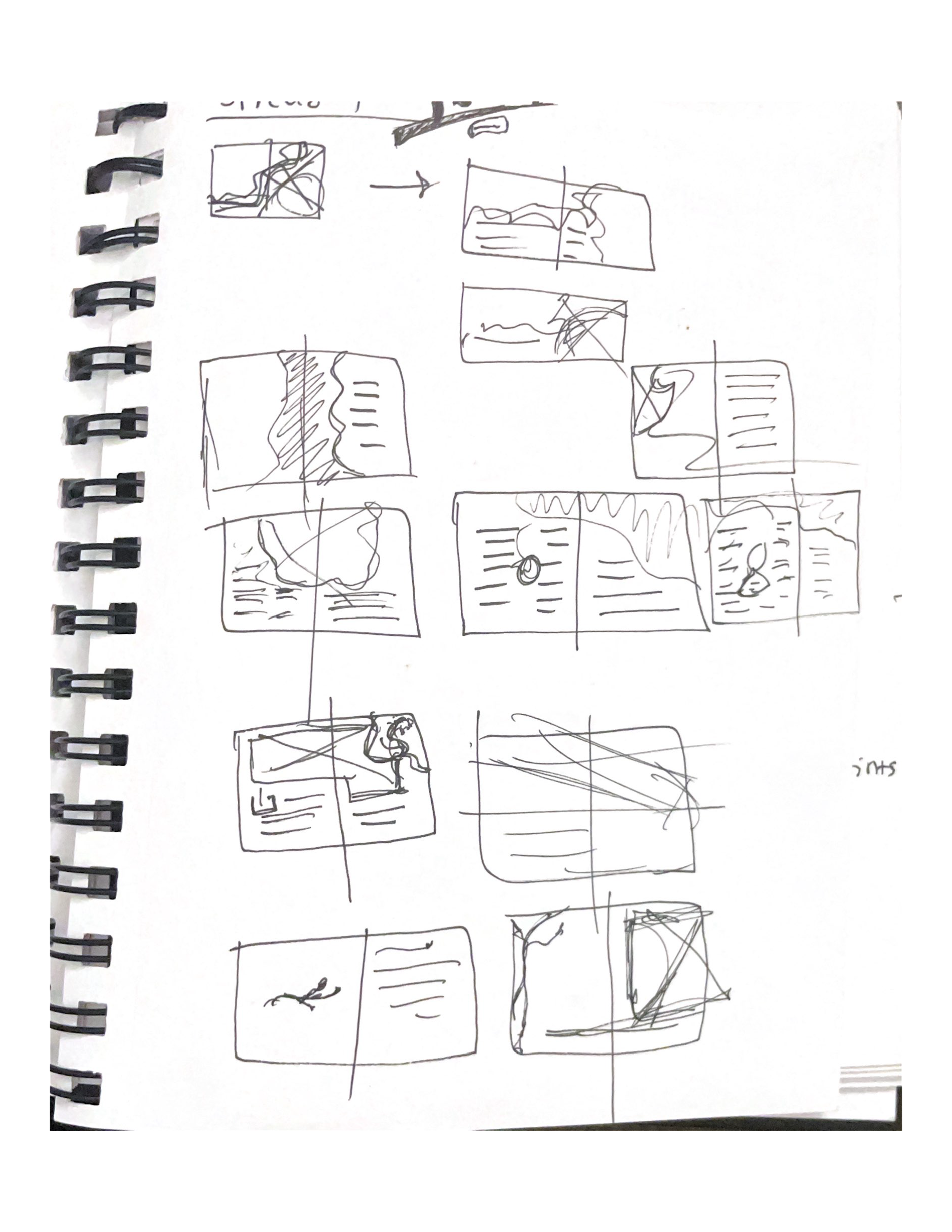
Process work | Sketches
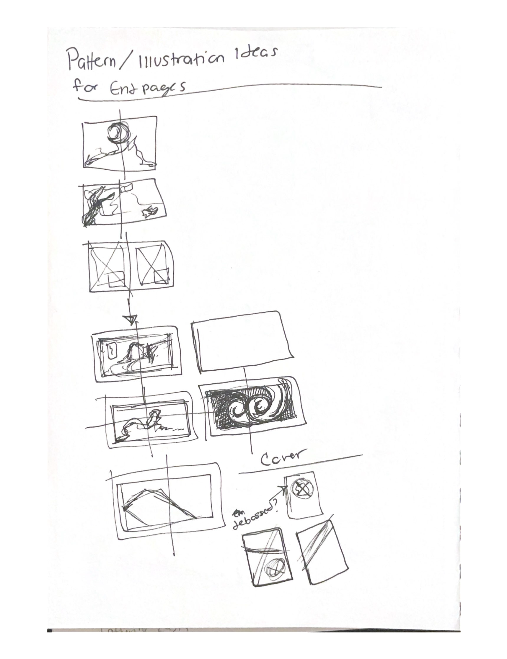
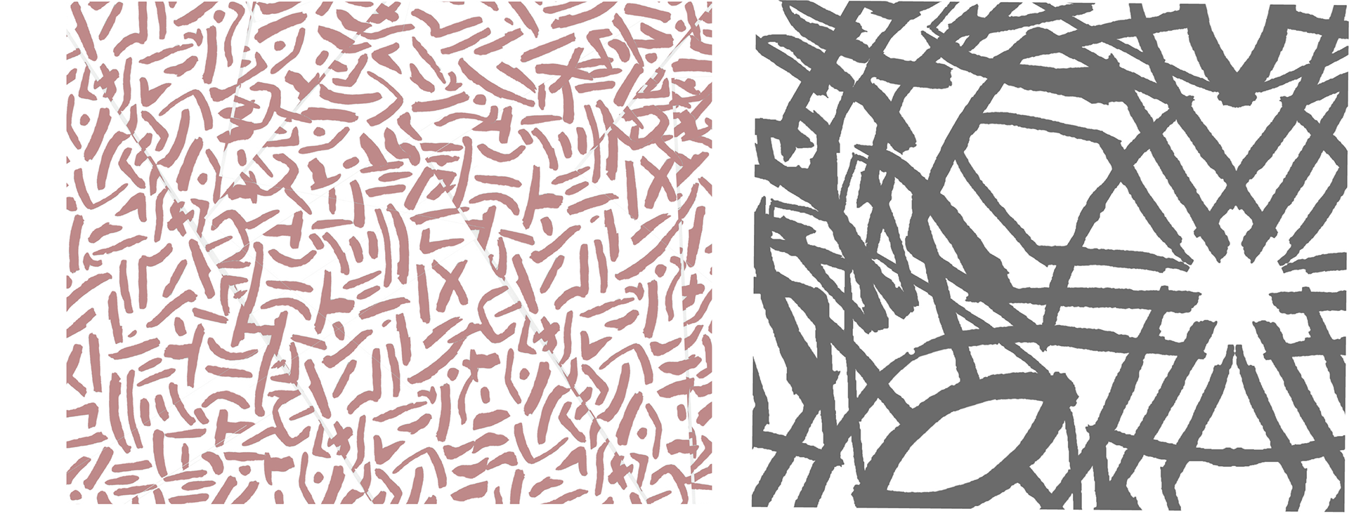
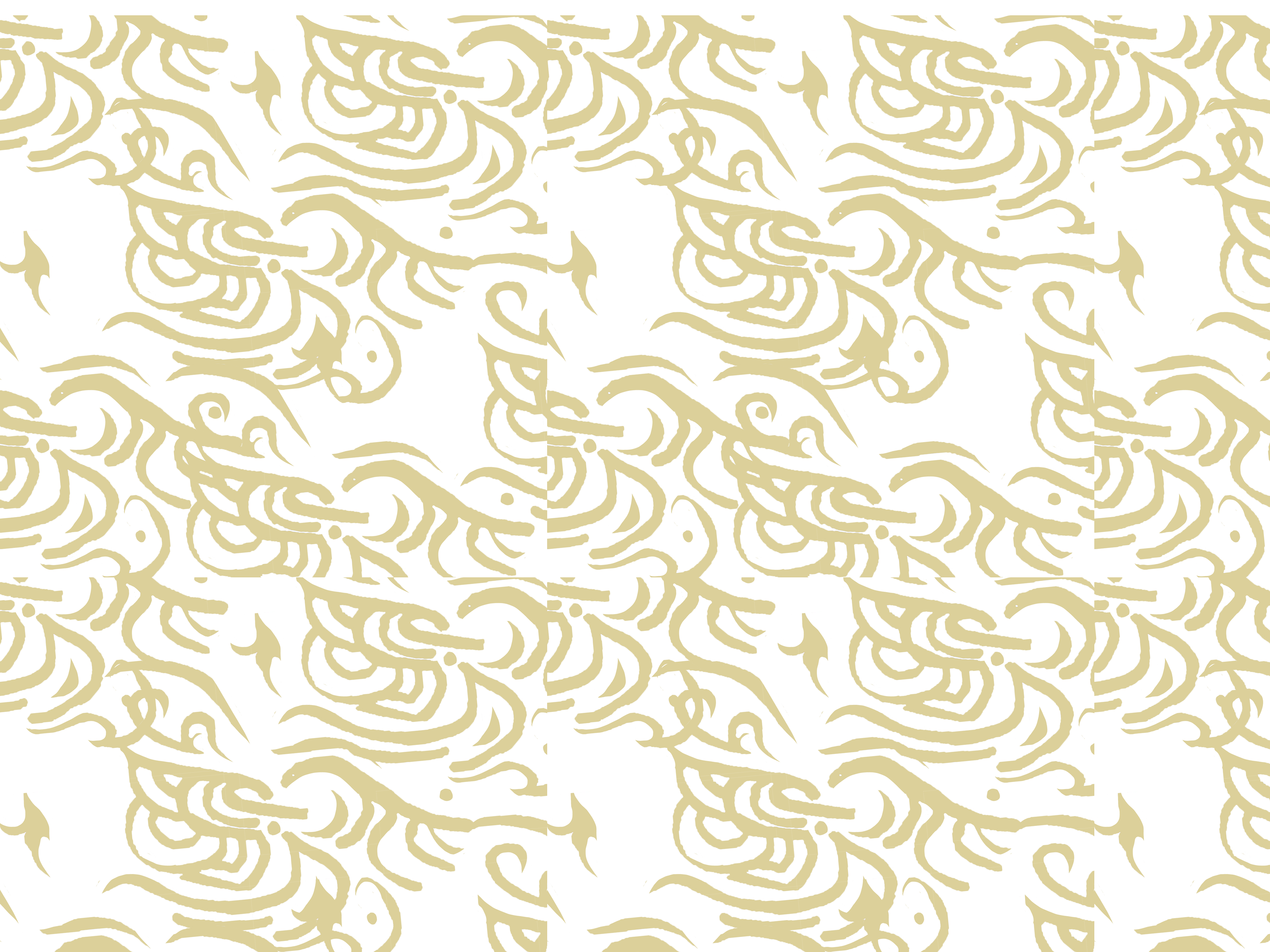
Process work | Pattern texture experiments
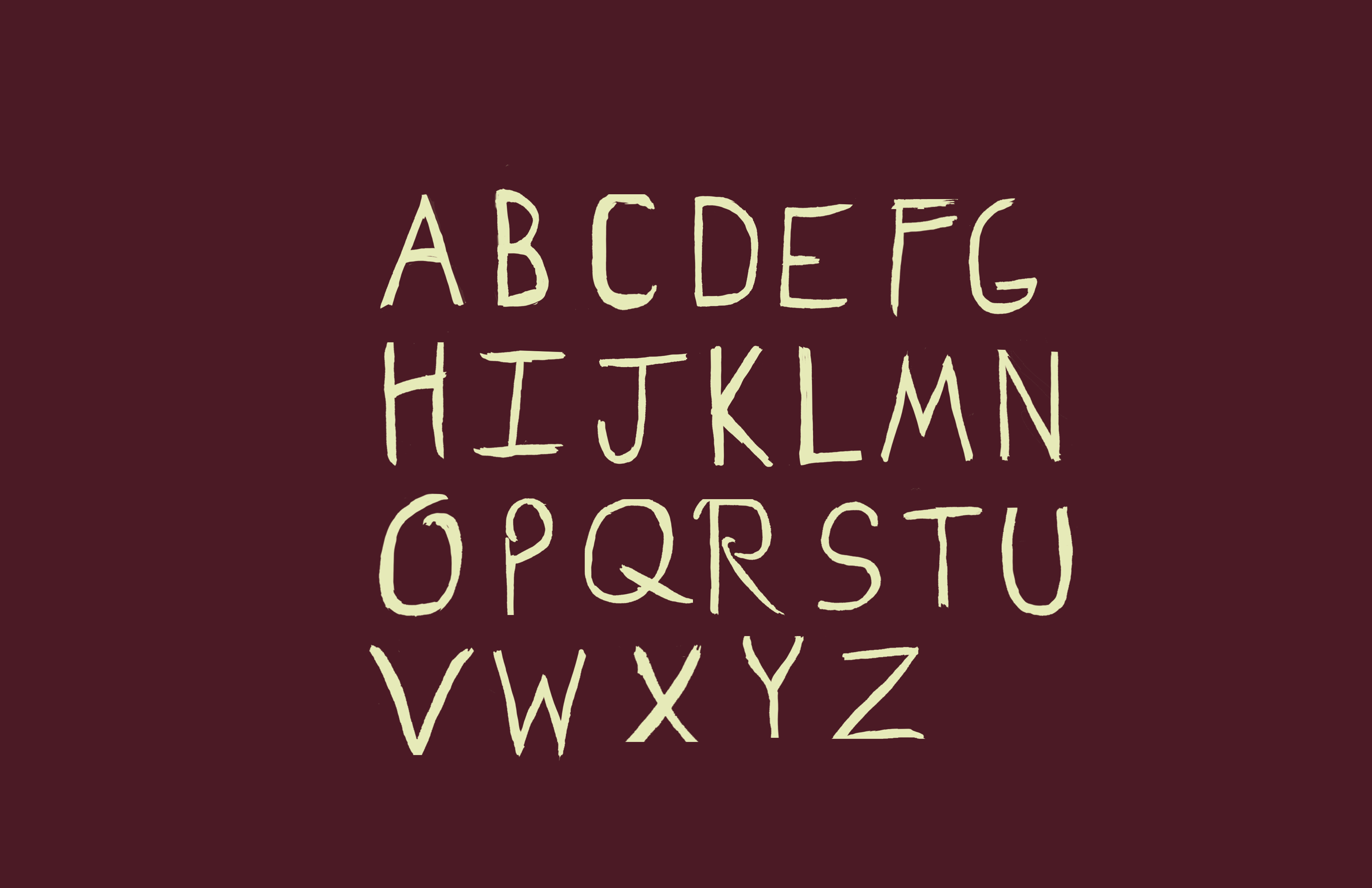
Hand–Done Type
Date Completion | Fall 2022 | Movements in Graphic Design
Art Direction | Cassandra Reese
Institution | PennWest Edinboro University
Typeface | Source Sans Pro
Size | 9in. x 12in.
Materials | Ink, Aged Newsprint Paper, binding thread