
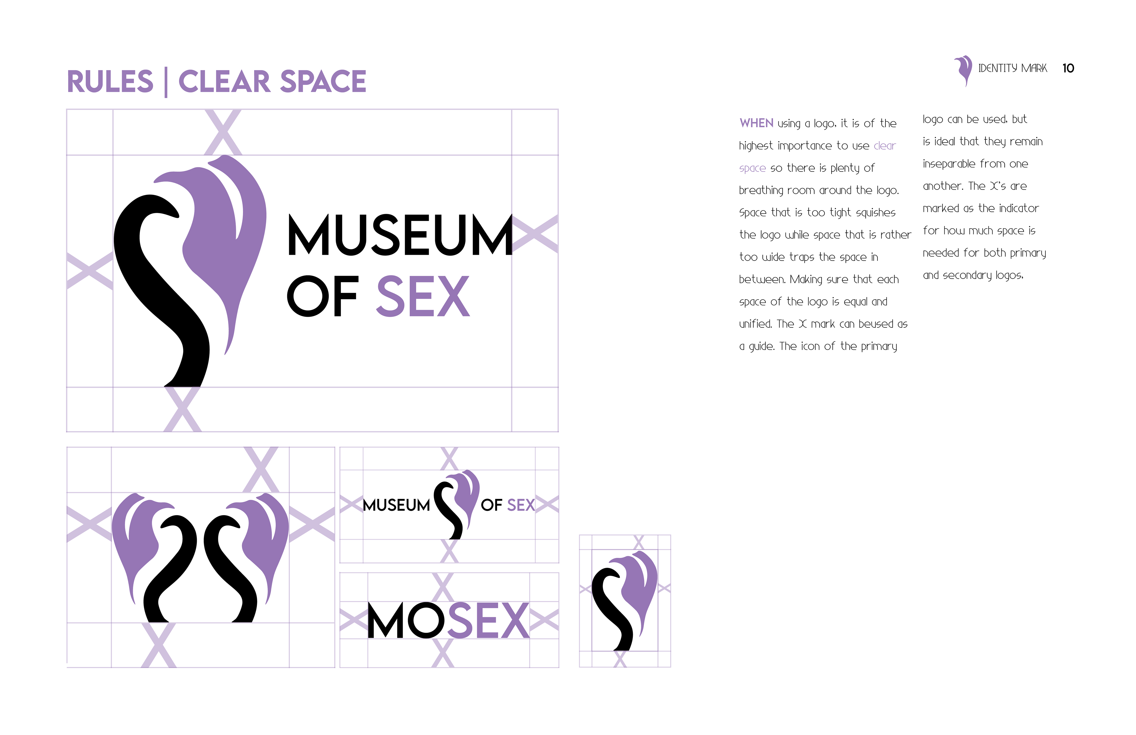
Summary
The Museum of Sex is a museum that educates an audience about sex by looking at some of its culture and the history from the sixties. With the idea of a new location of the museum opening in Miami, the biggest thing for my concept was growth and new beginnings. Some contextual insights include many protests in regards to sex and exhibitions that feature historical features.
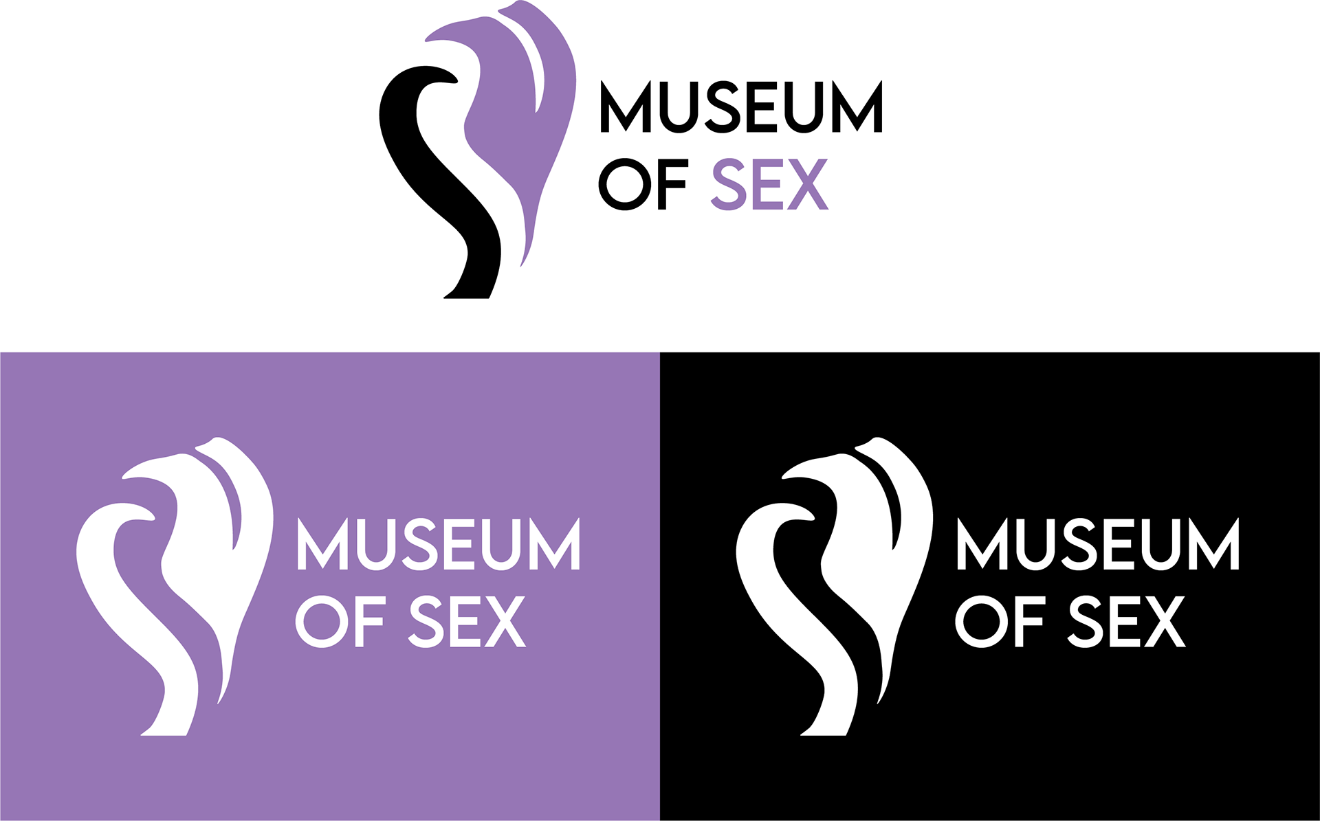
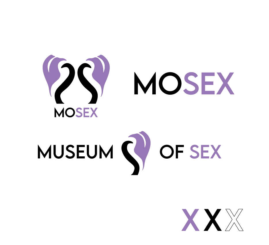
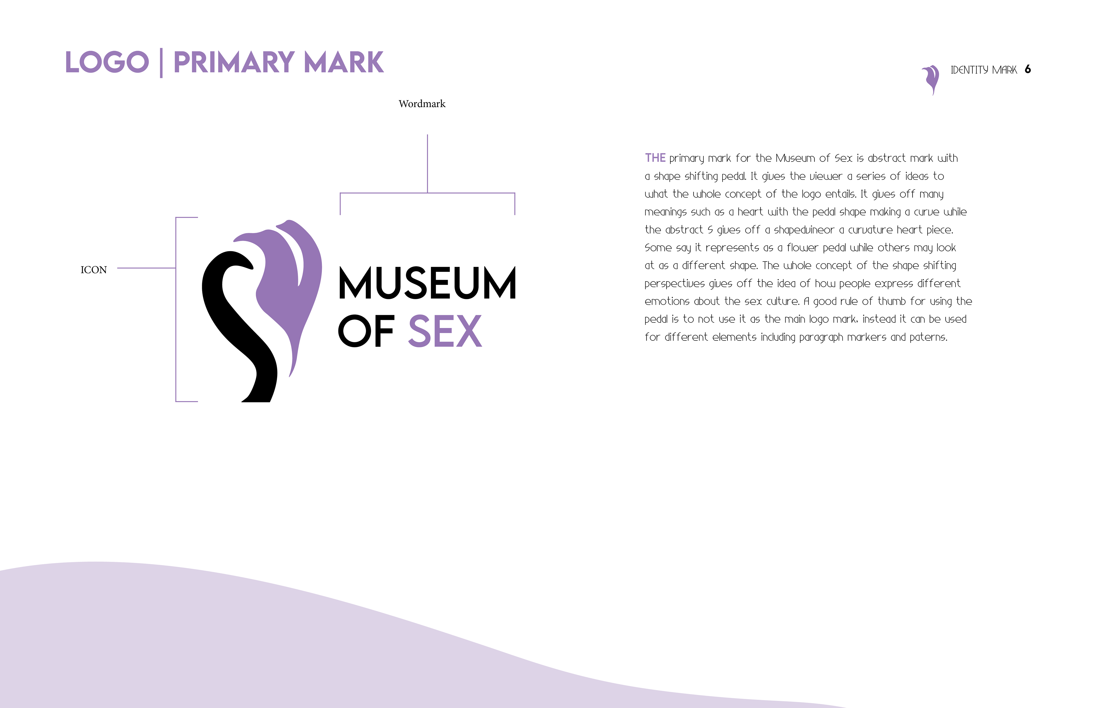
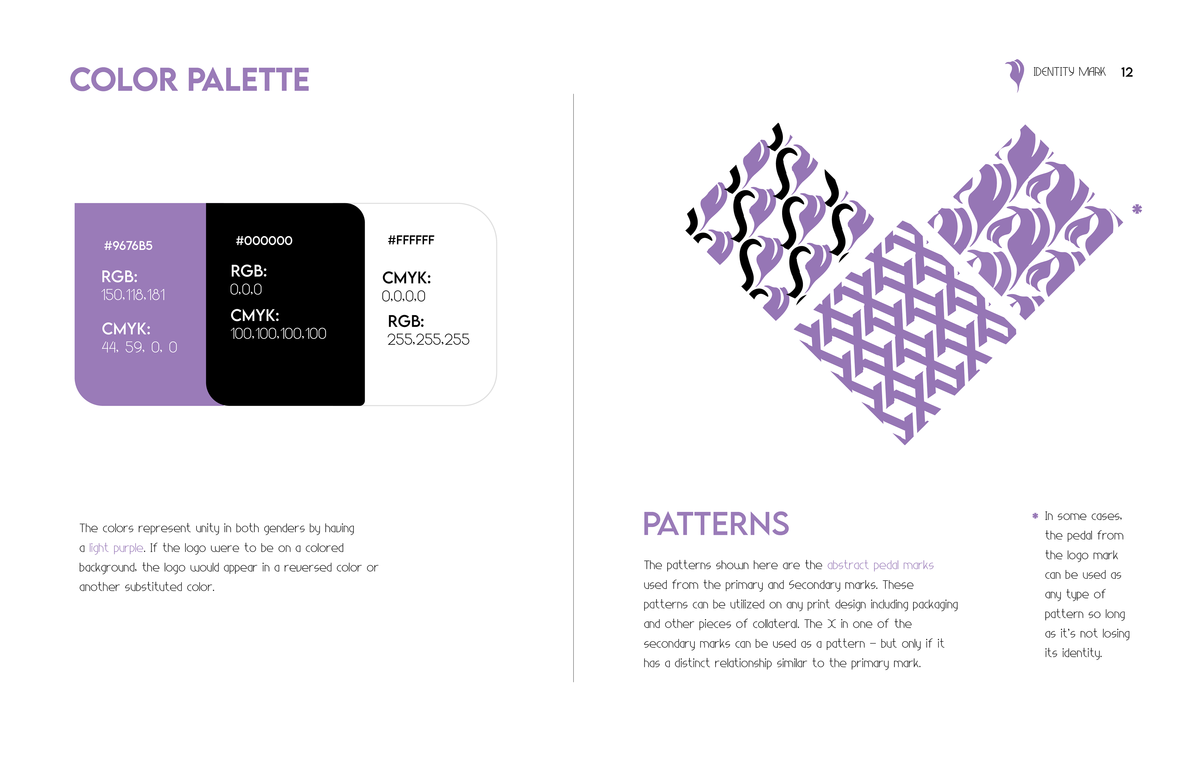
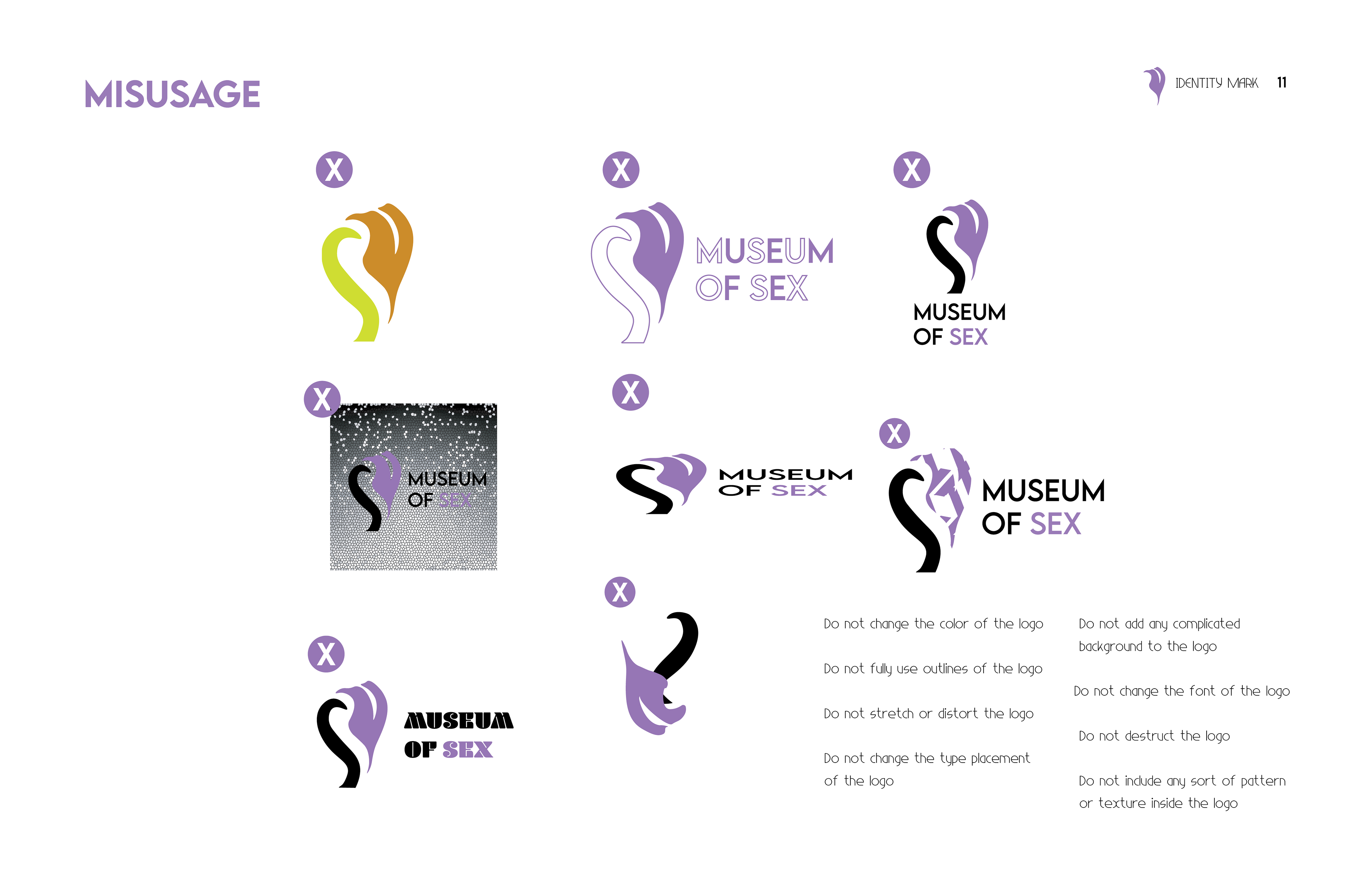
What inspired this logo was the overall mission statement and the abstraction art from the museum’s art collections. Looking at some of the attractions the museum of sex has was I went with a more abstract but clean logo. The pedal was used for both the main and alternate marks to symbolize love. Purple was the main color used to represent unity in both genders and sensuality and luxury.
Primary Logo
Alternate Logos
Alternative Marks for Ephemera

Icons for UX/UI (i.e. Favicons)
Ephemera + MOTION LOGO


Digital Brand Guide (Spreads)
Date Completion | Spring 2023 | Corporate Identity
Art Direction | Scott Gladd
Institution | PennWest Edinboro University
Typeface | Lemon Milk